This time I would like to write a slightly different article and share a bit about me and a bit about what I love about design and architecture here in the Netherlands.
What is architecture for me
I came to the Netherlands about 27 years ago. I never thought about becoming an interior architect. I thought I would be a glass sculptor or a fashion designer. I grew up in Israel and let’s face it, most buildings in Israel were not impressive back then. Only if you were interested in Bauhaus style, which you could find plenty of examples in Tel Aviv; however you really had to look for them carefully since they were in a poor state.
What particularly attracted me in the Netherlands was the colorfulness. If in Israel most of the buildings were white painted inside and outside or clad with light colored stone, in The Netherlands I was fascinated by the brick houses. The bricks were mostly in reddish shades but not only. When walking on the streets, one could see many more colors and special elements. I invite you to walk in one of the city centers and look up, above the shop windows. You’ll be amazed by the details and the beauty you will suddenly notice. It still happens to me even in streets that I passed hundreds of times.
The colorfulness also existed inside the houses. When I told my partner and his father, who is also an interior architect, that I wanted to paint the walls of our apartment white, they were just shocked! They argued that it is a cold color and not suitable for residence. Today when I log on to Instagram I ask myself where have these days gone?
Here the soul of the sculptor in me awakened, I saw the possibilities inherent in architecture. What attracted and fascinated me was the possibility of working with an unlimited amount of materials.
Not just glass, not just clay or fabric but a wide and renewable array of materials. You have no idea how much it excited me. For me interior architecture is actually sculpting people’s spaces.
This was just the beginning, in my studies when I was exposed to the art streams of the 1920s and 1930s and especially to a stream called De Stijl, I found myself in a new and magical world.
De Stijl (Dutch: ‘style’)
So what is this stream about? It was an artistic movement in art, design and architecture centered in the Netherlands.
The group tried to create an ideal of harmony and order. They espoused abstract and pure art with a tendency to reduce each object to its pure form and color. The principles of the movement were the use of only vertical and horizontal lines and the use of the basic colors (red, blue, yellow, white and black). The relationship between the line and the color was usually: horizontal line – blue: like the horizon line of the sea, vertical line – yellow: like the sun’s rays standing to the ground, black and white as neutral colors that help the composition and red as a special color. You are probably familiar with Mondrian’s works from this period, but I actually fell in love with Gerrit Rietveld, who stood out in the group in the field of design and architecture.
Gerrit Ritfeld and the reasons for my fascination
Gerrit Rietveld’s works constituted the three-dimensional interpretation of De Stijl and emphasized the independent line and plane in space and not the volumetric and mass.
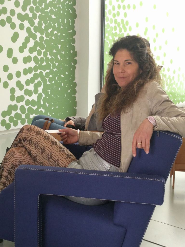
I like art that is dynamic and non-static. In paintings I like the surrealist style the most, every time you look at it you discover new elements that you have not seen before. In sculpture, I’m fascinated by glass, when you look at it or move it, the piece changes shape. This applies for me also in interior design, you might have already noticed this if you have read my article about functional furniture. So, apart from the attractive use of colors I was attracted to Rietveld’s work because of his dynamic design.
Gerrit Rietveld was the first to create dynamic spaces. His masterpiece was the Rietveld Schröderhuis. The house was built in Utrecht in 1924 for a client named Truus Schröder, who commissioned the house for herself and her children. Her request was that the house would be as far as possible without interior walls.
The ground floor can still be seen as “traditional” – a kitchen and three bedrooms arranged around a central staircase. The second floor is the one that changed the face of history and influenced the style of architecture to this day. Instead of a static collection of rooms there is an open, dynamic and changing space.
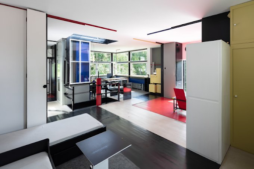
The living area is a large open space, the only area surrounded by a wall is the bathroom and toilet. In order to divide the space into rooms, a system of moving and rotating panels was established. When all the partitions are closed, a floor is obtained with three bedrooms, a bathroom and a living room. Between this state and the completely open state there are many different partition combinations, each of which has a different space experience.
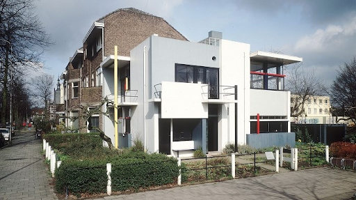
The facade of the building is a collage of two-dimensional planes and one-dimensional lines that are intentionally detached from each other and look like they are overlapping one another. The goal was to prevent a sense of three-dimensional mass in the building, and to define the interior spaces only with planes and lines. Each such component, based on the De Stijl principles, has its own exact shape, color and location. Surfaces in white and gray, lintels and frames in black and various line elements in basic colors were chosen in order to strengthen the sense of plasticity of the facades. The balconies are part of this total composition.
But
I must say that despite its architectural qualities, I share the opinion of those who think that the location of the building is not optimal in relation to its surroundings. The house was built in the center of a neighborhood with traditional uniformed houses. The back of Rietveld’s Schröderhuis is adjacent to a wall common to one of these houses. The shape of the house doesn’t blend in harmoniously and I may say it’s even jarring. In my opinion, it would have stood much better in an open space.
If you have not yet visited this house, I invite you to put it on the “must visit list”. Even if you are not an artist, I promise you that it will leave an unforgettable impression on you
LocHal – an inspired and inspiring architecture
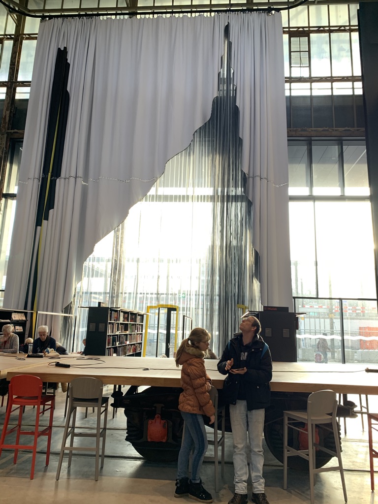
I would like to recommend you visit another pearl of architecture which I think undoubtedly was inspired by Rietveld’s technique. The library building in Tilburg called LocHal, which also won architecture awards. This is an old hangar for locomotives that has been converted into a library. Among other impressive architectural details, the spaces are dynamically divided with the help of huge screens.
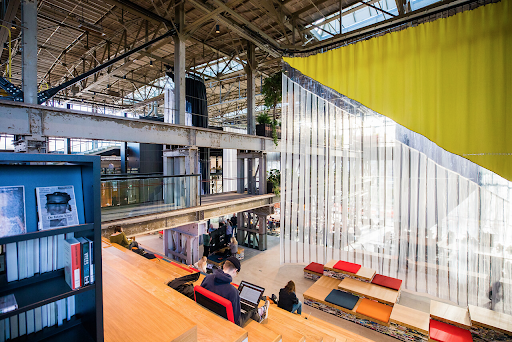
So who is still afraid of blue yellow and red?
I hope I opened for you a door to look at colors in a more positive way.
If you want to learn more about the effect that colors have on our well being, I invite you to read my previous article about it.
